
If you want to convert your website visitors into customers for your online courses or any of the other ways you monetize your expertise, you have to know how to create landing pages that convert.
Period.
Landing pages are the pages on your website where you convince your visitors to actually do something, usually something that involves handing over an e-mail address or putting in credit card information.
It may be the sales page for an online course or some other product you’ve created.
Or, it may be a page where you persuade a prospect to sign up for an e-mail list as part of building your audience – usually by offering some sort of special content as a “lead magnet.” Whatever your specific goal, it’s a place where you communicate value as effectively and efficiently as possible and convert anonymous site visitors into identifiable people with whom you can build a relationship.
A landing page is where the action is when it comes to selling products online. It’s usually the last place a visitor “lands” on your site before clicking the “Buy” button, and it can often be the first place as well.
If a user finds a particular product through a Google search, for instance, she may go straight to the page in your site with information about that course – i.e., the landing page for that course – and never see anything else on the site.
The stakes are high – you need to get that user to click “Buy,” or “Subscribe,” or something similar while she’s on that page, or you may lose her forever.
Landing Pages 101
So what’s to be done? Here are 10 “landing page 101” tips for creating landing pages that convert:
1. Use concise, benefit-driven headlines
A good landing page will have a title or heading at the beginning of it – i.e., large, bold text – that gives the visitor a clear idea of what she will find on the page. If this is a course sales page, don’t just use the title of the course for this: state concisely the major positive outcome the visitor will receive from the course. Speak to what you feel your prospective learners care most about – and what you promise to deliver. Your headline sets up your offer, one of the most critical components of any landing page.
2. Don’t squander “Above the fold” space
“Above the fold” simply means the area of the screen that most people see in their browser without having to scroll. People tend to focus on what is at the beginning of a page, and to a lesser extent, what is at the end – they are likely to skim most of the rest. So, you really need to make this space count.
Make sure any images you use are highly relevant to your offer and pair these with text that really speaks to your target visitor. If, for example, you offer credit or some other form of validation for your course and you know the users you are targeting value that highly, make sure you say it above the fold. Testimonials above the fold can also be highly valuable (more on that below).
In general, if you have gotten people to your landing page, you already have their attention. The minimum goal with your above the fold space is to build their interest as rapidly as possible. So, it’s worth putting significant time and effort into understanding what information is most likely to be of interest to your target visitors and make sure they see it as soon as they land on your page.
3. Have a clear call to action
A “call to action” is simply your request that that the visitor do something. In the case of a course sales page, this means clicking a button to make a purchase. For a lead magnet, its a click to gain access to whatever you are giving away.
On some types of landing pages – particularly lead magnet pages or newsletter sign-up pages, on which you are not actually asking for payment – it makes sense for the call to action appears above the fold. You probably won’t get the reader’s attention for too long no matter how good your copy is, so move them to action quickly.
For a sales page, you will likely need some “runway” copy to build the momentum that will lead to action. You above the fold space sparks your visitors’ interest and compels them to scroll down the page to learn more. The call to action, in this case, is usually further down the page, often at the very end. If the page is relatively long, you may want to repeat the call to at least once on the page – generally following any copy in which you have made key selling points.
In general, whether the call to action is above the fold or further down will vary according to factors like the complexity of the product, price of the product, and how users arrive on the page. The more costly and more complex the product and the “newer” the visitor – e.g., people who click ads versus your long-time e-mail subscribers and/or past customers – the more likely the call to action will need to be further down the page – after you have provided the visitor with compelling reasons to take action.

4. Sequence content to build desire
As noted, in some cases you may call for – and get – action above the fold, but in most cases when you are actually selling something (and even many when you are giving something away), you are going to need to take your visitors on a brief journey that leads them from the interest you create above the fold, to a desire for whatever you are offering, to action.
To do this, you need to reinforce the relevance. Chances are are good that relevance is already implicit in whatever promise your headline and above the fold content make, but you will likely need to reinforce it as visitors move down the page. Why is what you are offering valuable? How is it going to make life easier or better? If that’s not crystal clear, interest will fade quickly.
You also need to build trust and authority as visitors move down the page. The bigger your ask, the more they are going to need to believe that you or your company have the experience and expertise required to deliver on your offer – and, ideally, that you have a clear track record for keeping your promises. You can do this by sharing case studies and outcomes data relevant to your offer as well as by providing testimonials from satisfied customer – a topic I address more below.
5. Use compelling sub-headings
I note above that visitors to a page will generally skim most of the content below the fold. Using compelling sub-headings – i.e., larger, bold text – helps to call attention to and guide people through the sequence that leads them to action.
You might think of your sub-headings a sort of mental checklist or set of questions that a prospect is likely to bring to your page. They may may not do it consciously, but most prospects will be asking themselves a series of “Does it do this?” and “What about that?” questions as they skim over your page. Your job is to understand as much as you can about what those questions might be and make sure that your sub-headings speak to them.
6. Provide social proof with testimonials
As noted above, testimonials should almost always be a part of the content sequence on your landing page. That’s especially true if it’s a sales page, but these days, I’m finding testimonials can be necessary even on any page where you ask a user to hand over an e-mail address or other personal information. People are increasingly protective of their data and skeptical of anyone who asks for it. Still, human nature has not fundamentally changed: we all are influenced by evidence that “people like me” have used a particular product or service.
So, if you are not in the practice of gathering testimonials from people who participate in your learning offerings, start today and start including multiple, high-quality testimonials in your landing pages. By “high quality,” I mean that the testimonials should speak as directly as possible to the major positive outcome your offer promises, it should include the name (and usually the title and company) of the person providing the testimonial, and ideally, it should feature a photo of the person providing the testimonial. For higher ticket items or just as general way to boost your trust and authority, video testimonials are especially helpful.
Keep in mind that most customers are not going to have natural aptitude for creating the type of testimonial that will be most beneficial to you, so be prepared to provide them with a draft. For tips on how to write effective testimonials, see this Smart Blogger post: How to Write a Testimonial in 2020: 7 Tips (+ 9 Examples).
7. Include relevant images
Pictures are a good thing in general on landing pages. The human brain process images much faster than text, so to the extent possible, your landing page should images that show or imply the benefits of what you are offering, help visitors trust you more, or simply build comfort and familiarity with the experience you offer.
For online courses, it can be helpful to provide images to show what the experience will actually be like – e.g., screenshots from inside your course. Additionally, some prospects may worry about lack of communication with an instructor or other learners, so pictures of people can be reassuring. As suggested above, try to get pictures of the actual customers who give you testimonials, but even pictures of non-customers can help unconsciously “humanize” your offering in the eyes of wary prospects.
8. Don’t send visitors away for more information
The only reason a visitor should leave a landing page is to take the action you want them to take. If you feel you have to provide additional information that might make the page copy too long, do it by using pop-ups or rollovers.
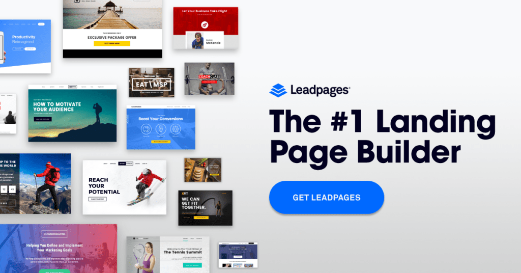
In general, your landing pages should be very easy to scan, and every heading should lead logically to your call to action. In many cases, this may mean turning off other navigation on the page, or – usually much easier – use a dedicated landing page builder like Leadpages to easily build and track high quality landing pages. (We use Leadpages with great success on my company’s main Web site at Tagoras.com.)
9. Keep it simple
This rule applies first and foremost to the call to action. Don’t list five different pricing scenarios with a “Buy” link for each scenario. Use a single “Buy” button, or possibly a member and non-member button (if this applies to your situation). If you really have to offer more pricing scenarios than that (and think long and hard about whether you really do!), then do it on a screen after the landing page. In general, keep your language simple throughout the text on the landing page, and don’t present the visitor with extraneous options.
Remember, your goal is to get visitors to take a single action. To the greatest extent possible, anything that interferes with that should be removed.
10. Test, test, test
I’ll admit that I am often not as good about this one myself as I should be. When you publish a landing page – even if you have used all the tips above – you don’t really know if you have gotten it right. For landing pages that convert, the only way to be confident is to test different version of the page, changing one key element at time – e.g., your headline, a key image, the placement of your call to action.
Any specialized landing page software is going to provide capabilities for doing this sort of testing – typically called A/B split testing. For a free option, you can use Google Optimize. A detailed discussion of testing is more than I can provide in this post, but Hubspot provides a great resource on the topic here.
***
Address each of the points above, and you will be well on your way to selling much more of your online training and education products.
Jeff
P.S. – Bonus Tip: Consider including both a bonus/incentive and a guarantee – particularly for sales pages. The prospect should feel he has nothing to lose (the guarantee) and something to gain (the bonus/incentive) above and beyond whatever other value you are offering.
***
